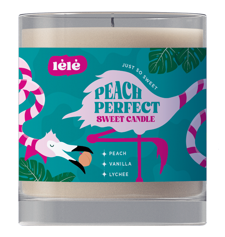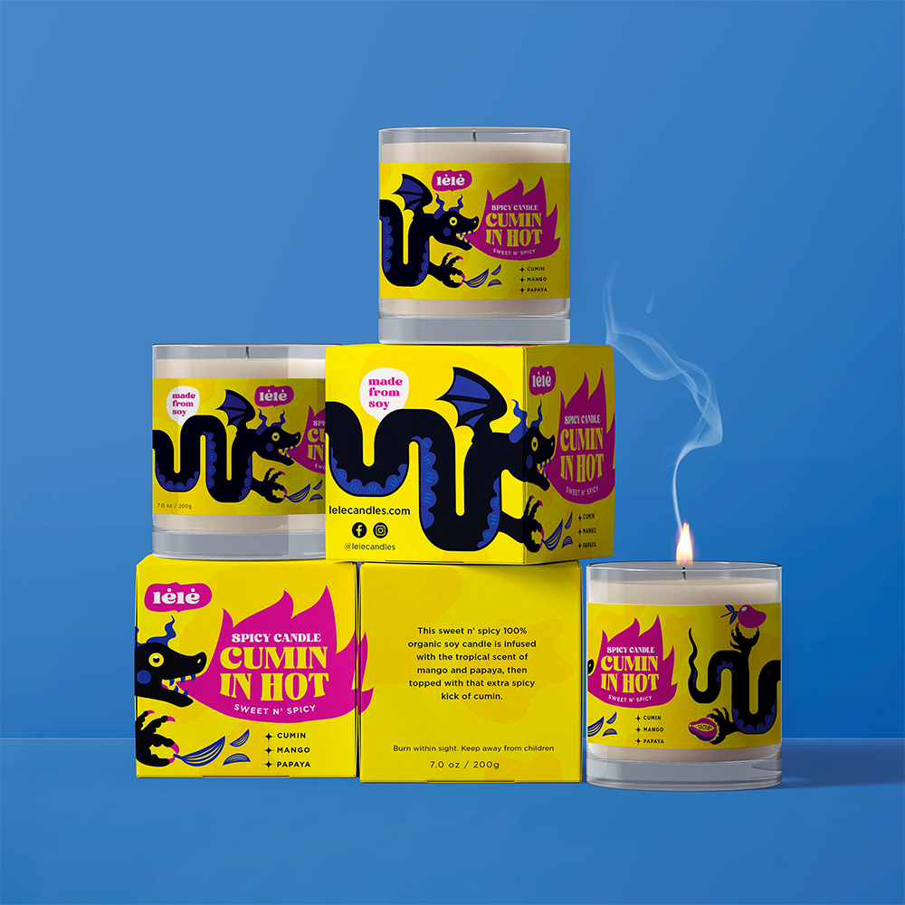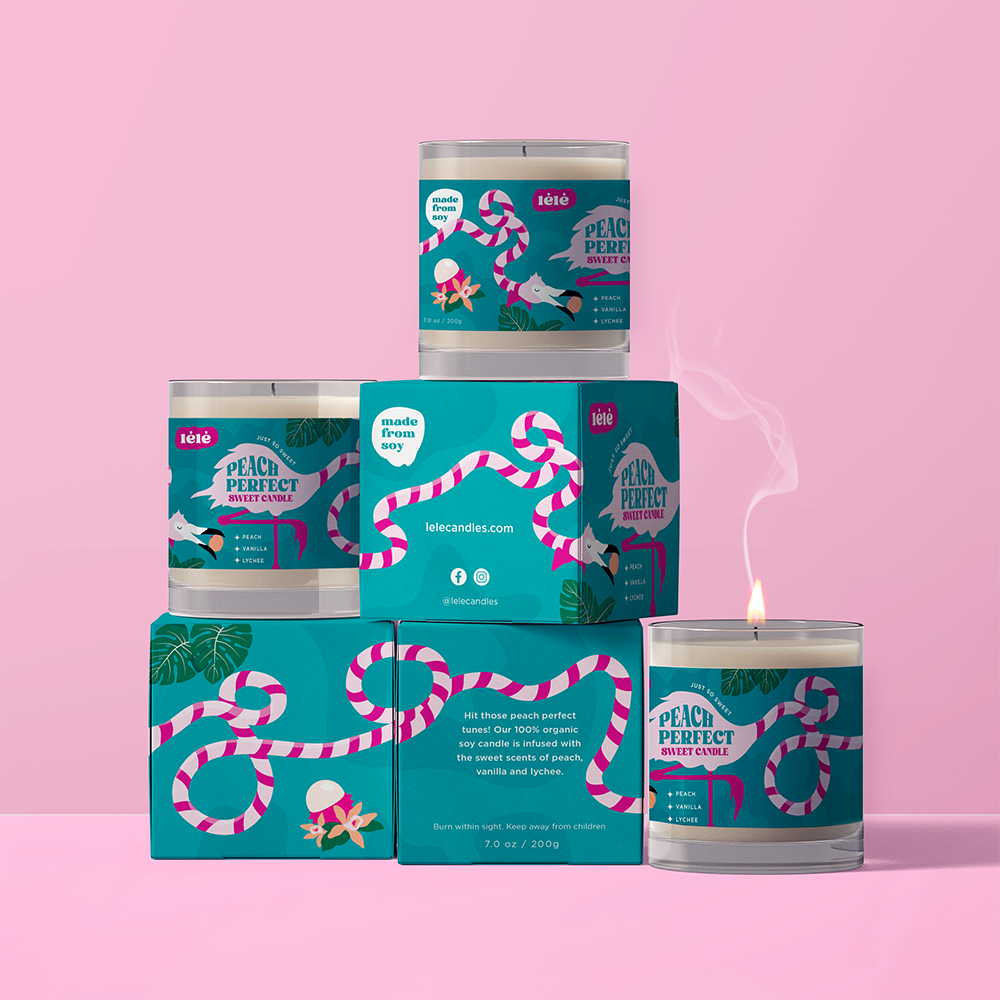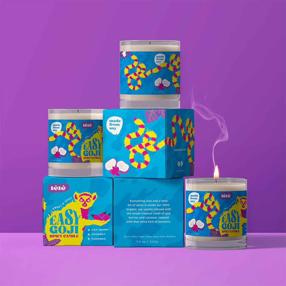
The market of scented candles is extremely saturated. Most brands lean towards a vibe that relies either on minimalist sophistication or traditional cottagecore. lélé distinguishes itself by appearing young and vibrant, with an identity that feels as fresh and distinctive as the fragrances themselves. Inspired by the tropical ingredients and unexpected scent combinations, the visual language of lélé combines playful energy with a deep sense of storytelling. The result is fun, excentric, and makes the product provoke an emotional connection.
The logo
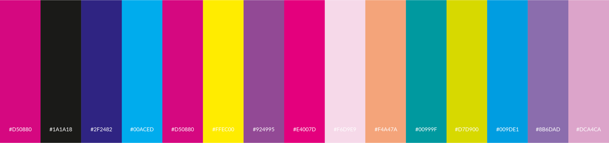
Developed to capture the playful character of the brand, the logo feels contemporary yet tactile. The bold custom wordmark can be used with or without the sticker. The flexible color palette allows the mark to shift with the mood of each scent while keeping the brand instantly recognizable.
The characters
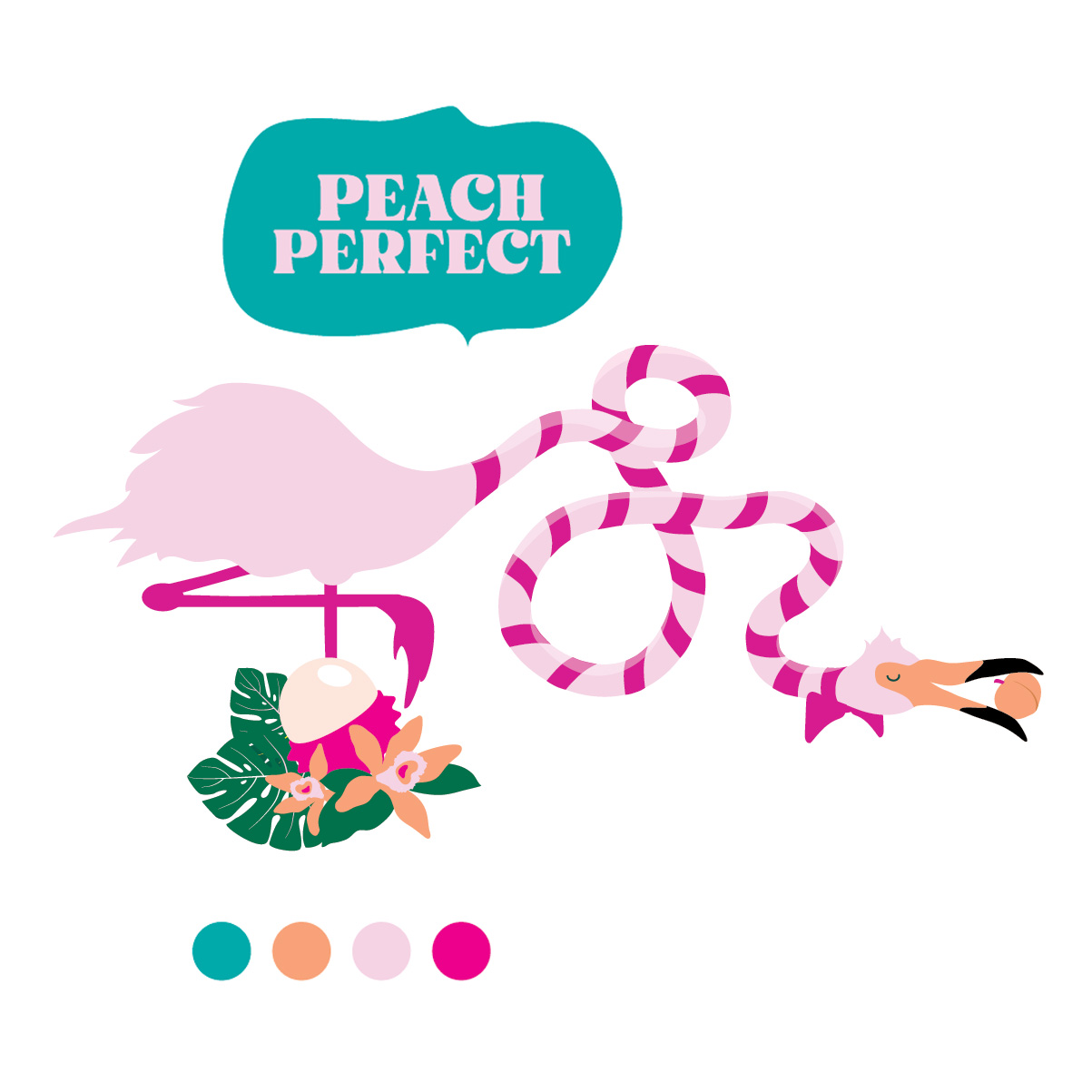
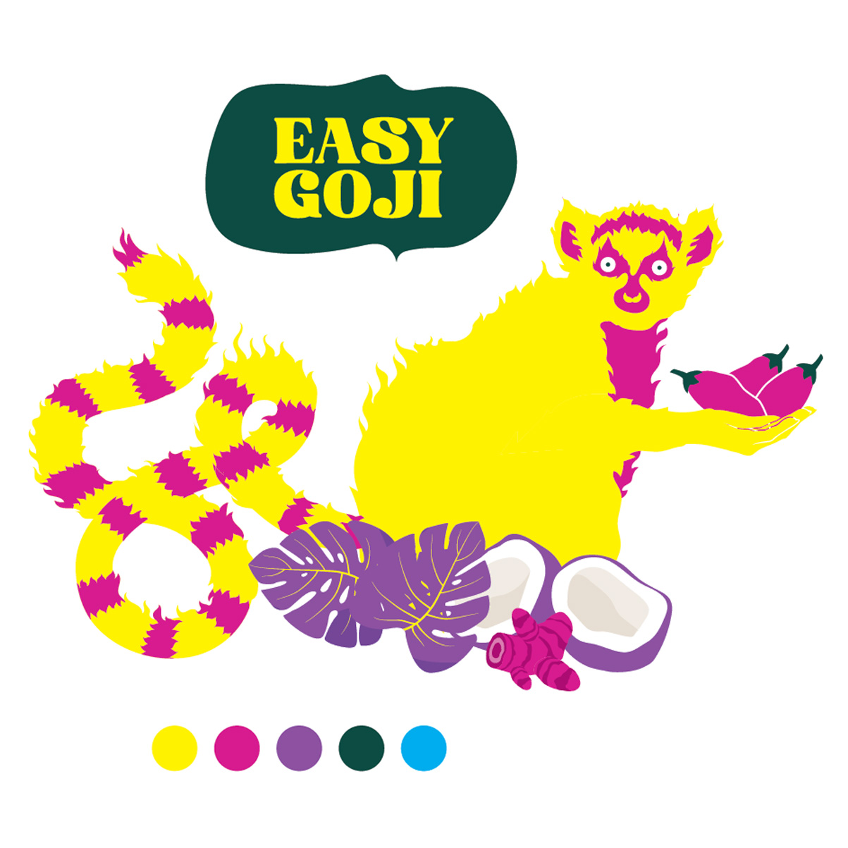
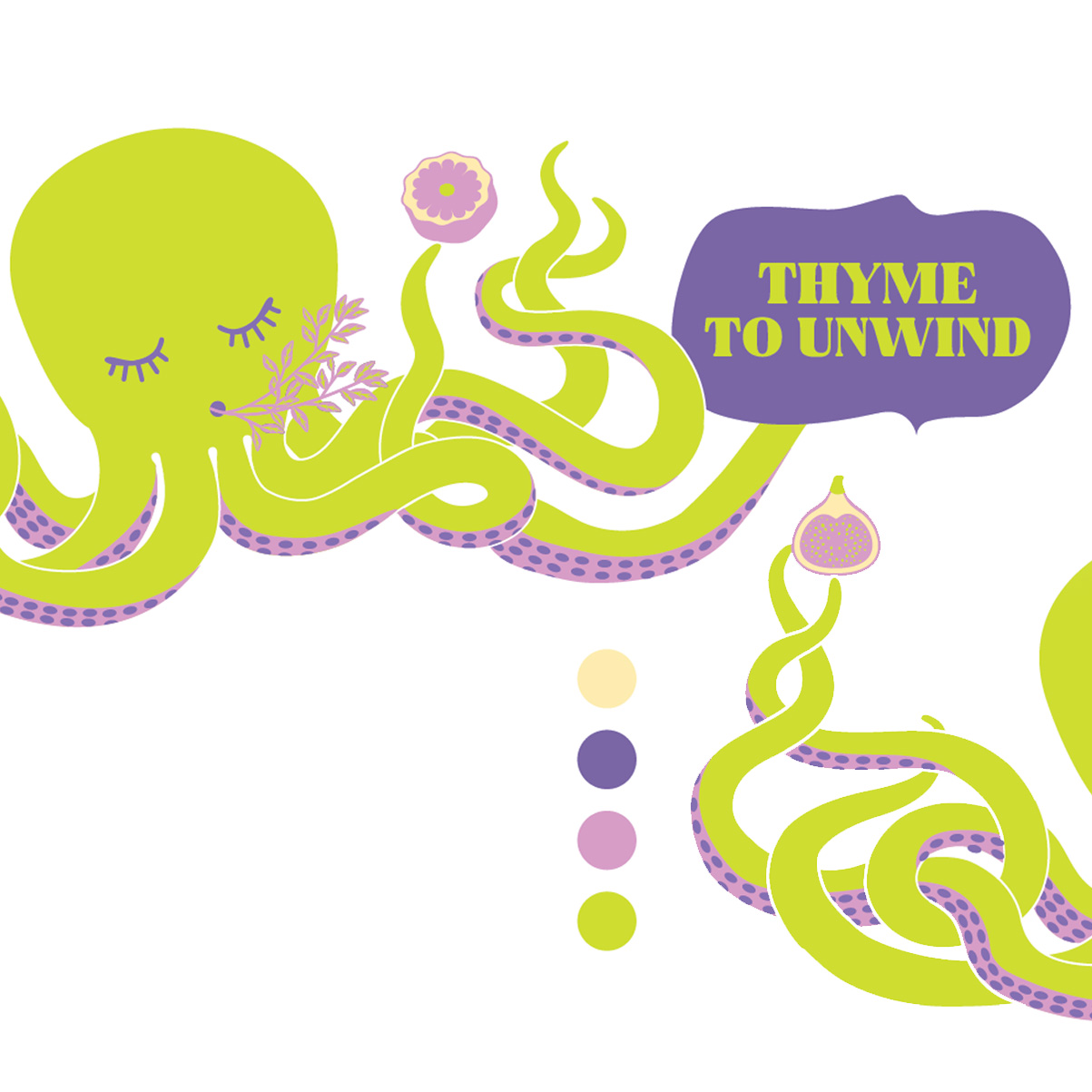
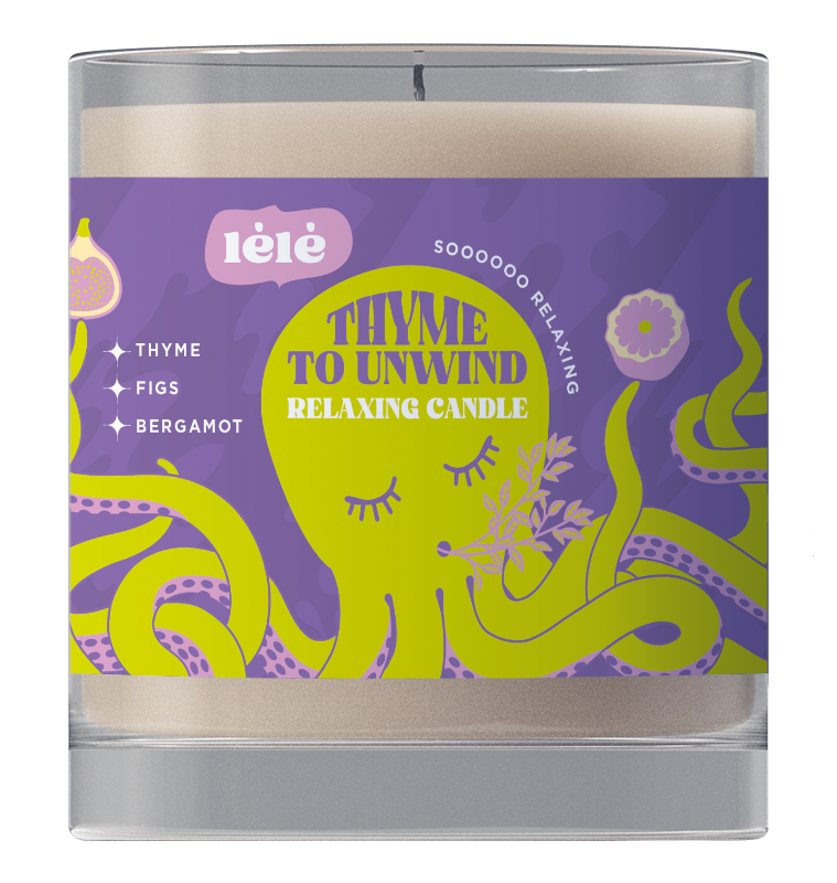
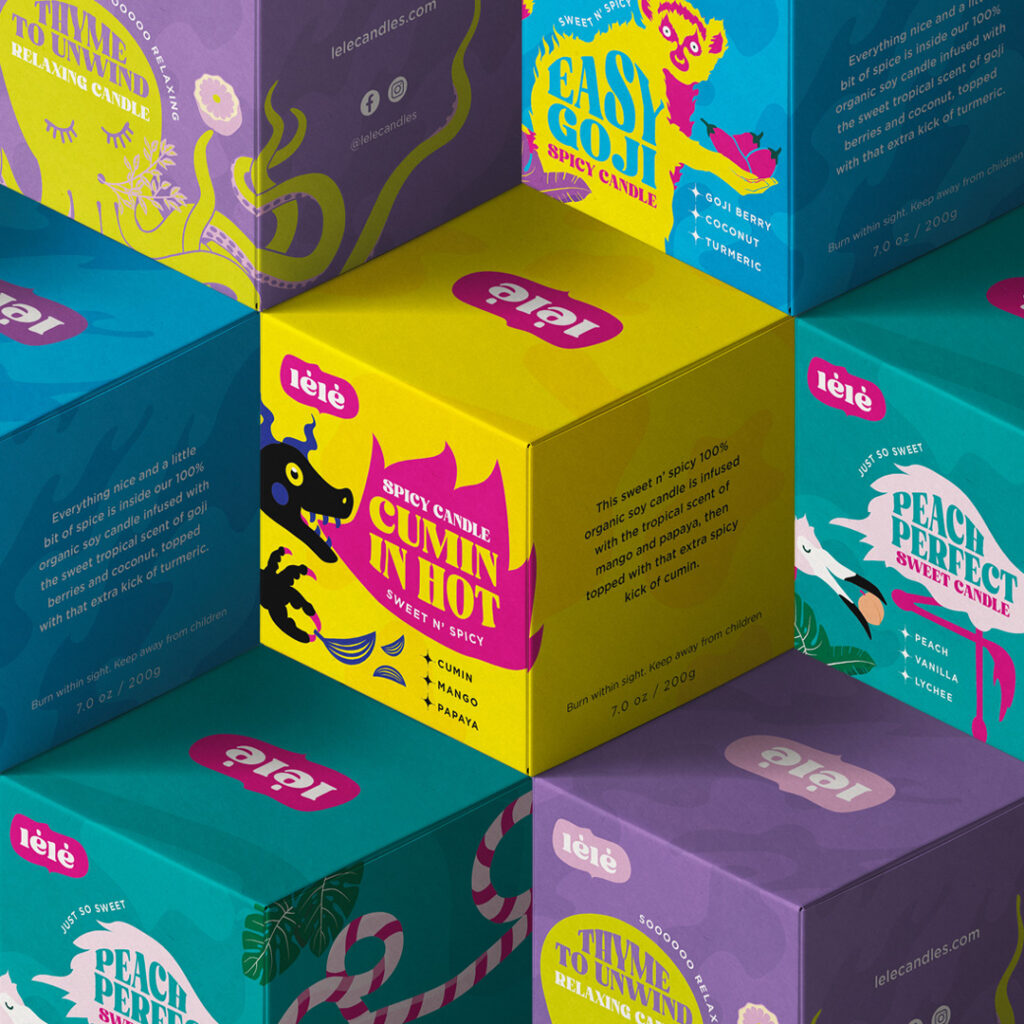
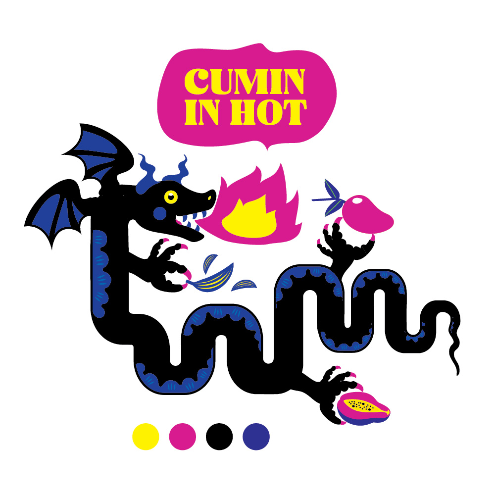
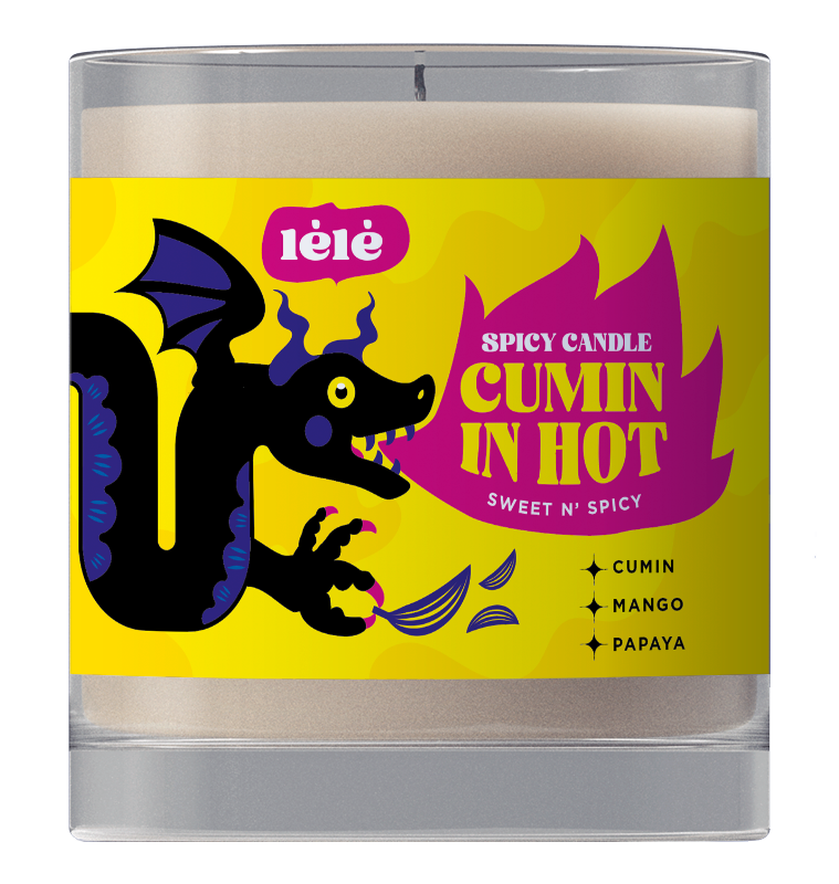
Each candle comes with its own character and color scheme, reflecting the specific personality and intention of the scent, making each immediately identifyable at the store, before even reading the text on the package.
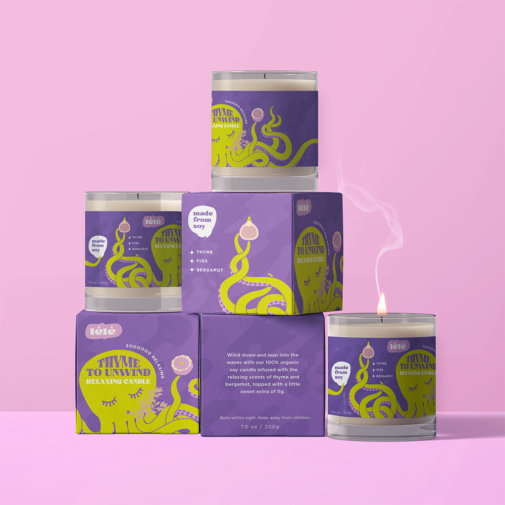
A relaxing scent made of thyme, figs and bergamot.
The candles
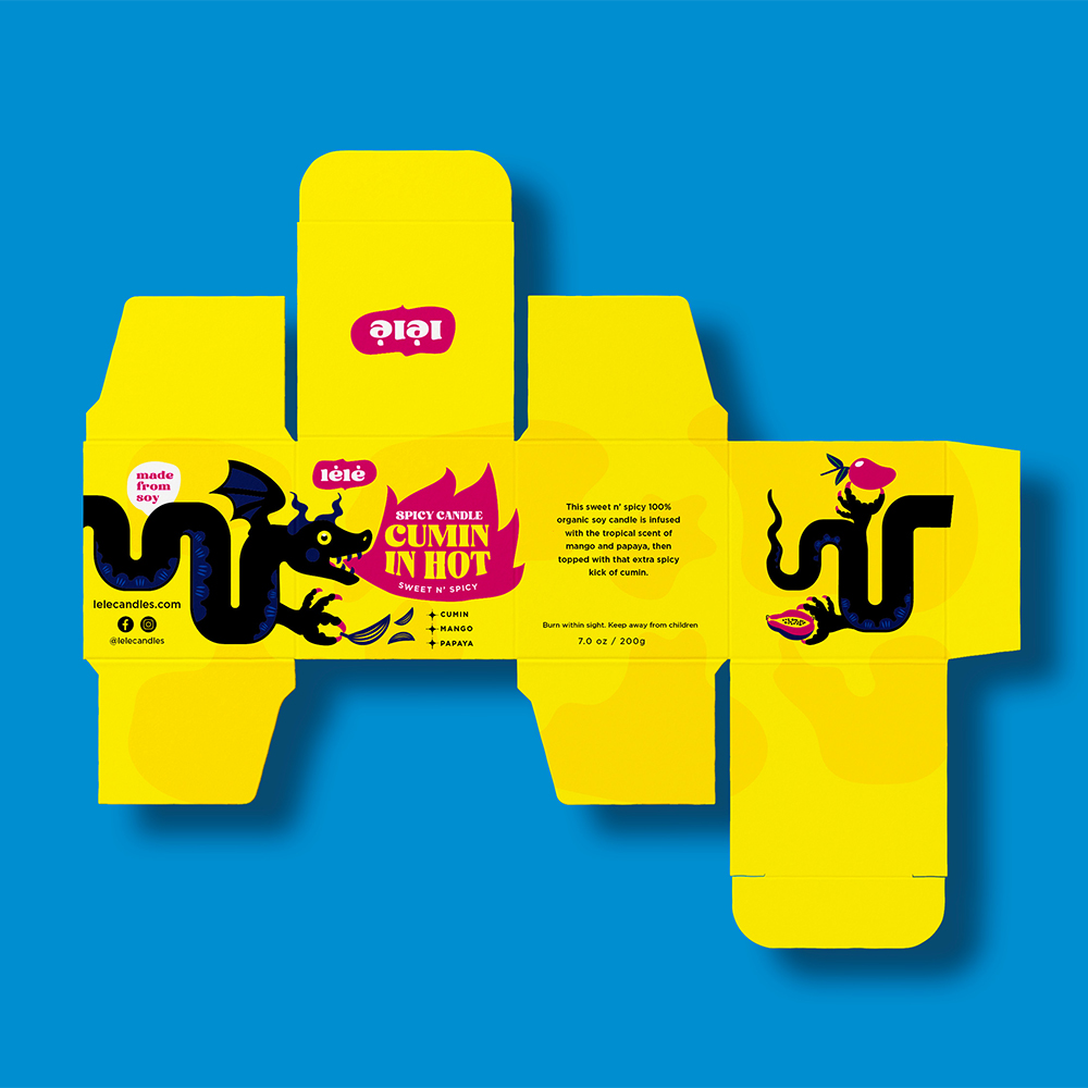
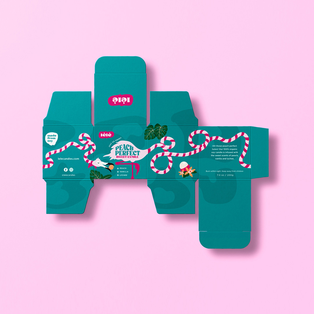
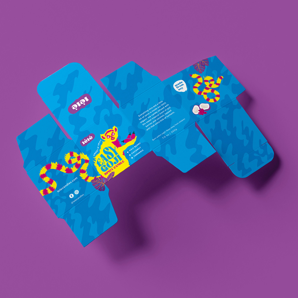
The Boxes
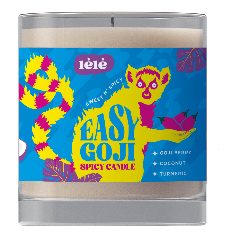
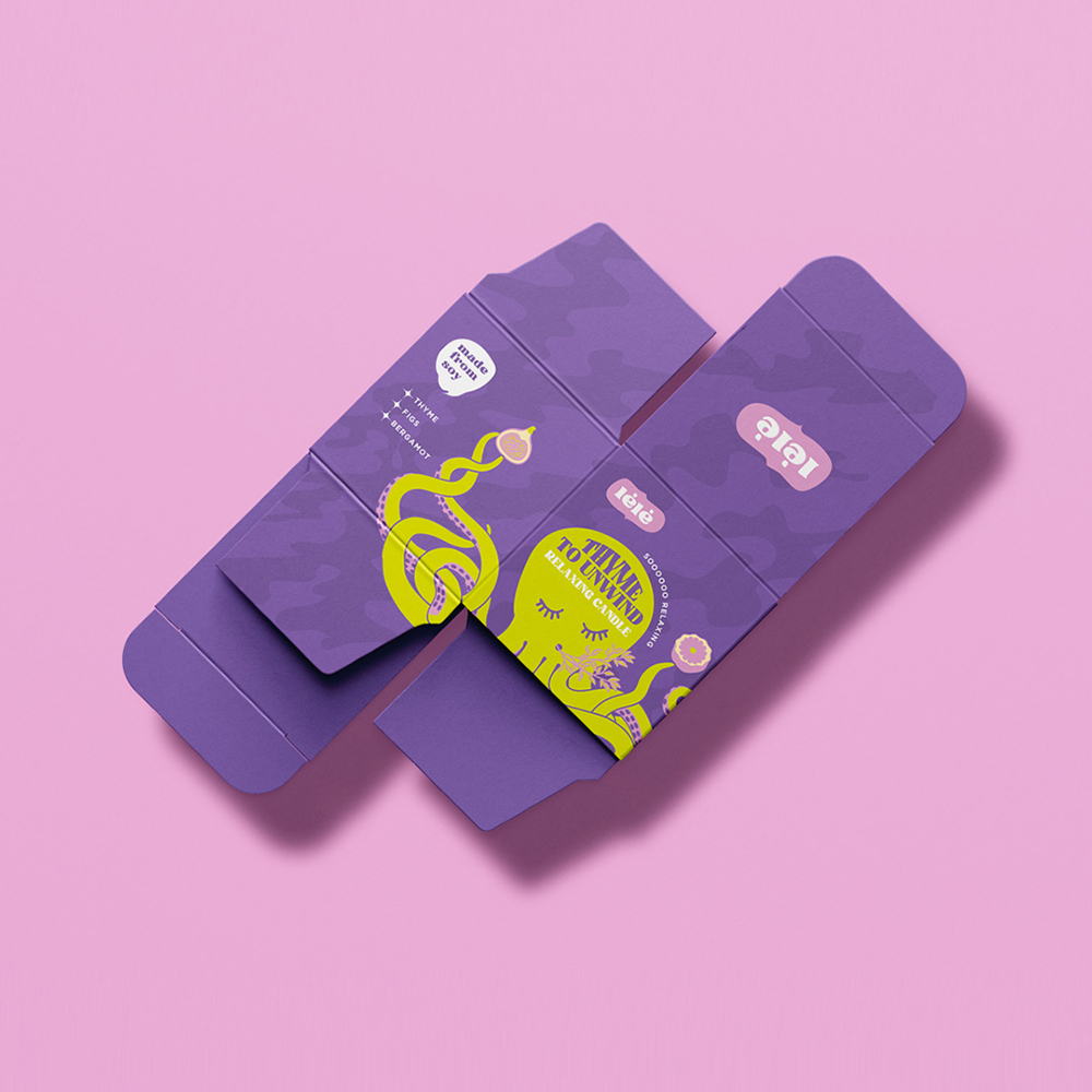
Just like the the candles, the packaging plays with a wraparound design, with a fun and bold but minimalist use of the space.
I created the entire concept and identity of the brand, including logo, CI and packaging. The brief was to create something that stood out among the competitive market of scented candles, with a fresh and fun aesthetic, representative of the excentric scents.